
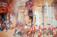
Poppy painting as a work in progress
Goodness as always is flying and it seems like ages ago that my last workshop was held in UK but it isn't actually that long. I have been working on my new book, experimenting and finding easy ways to paint popular subjects. I am aware that it is frustrating when you look at an art book and the full instructions are missing in a step by step. And it happens.
Funnily enough this week I have been approached by a few artists who couldn't get a technique they had read about. And they were asking me if I could help them. As it wasn't my book I kindly suggested that they write to the author as maybe they could help them reach their goal. I also felt it might be helpful to that particular author to know there was a problem with understanding the particular technique which isn't one I use.
I do help as much as I can, whenever I can, when asked questions about watercolour but this recent situation reminded me of a cook book I once helped put together for a charity when I was living in Hong Kong. The proceeds from the book were to go to an orphanage and everyone contributing was doing so for free. Every recipe would be tested by a group of willing volunteers, myself included, and if the recipe was successful it would go into the charity cook book along with the contributors name. We had some fantastic recipes donated from all over the world and we cooked each one. Most worked beautifully but one recipe was a disaster. No matter who cooked that dish it never looked or tasted right. I had the horrible task of contacting the contributor to ask if they had made a mistake with the ingredients. There was silence at first at the end of the phone. Then came back shock and disbelief that their recipe hadn't worked. I then explained honestly that several teams of volunteers had each tried to cook the dish following the exact given instructions and not one had ended with a good or edible result. Finally the contributor admitted that they had left one very important piece of information out of not only thelist of ingredients but also the method of cooking too. It was a "secret" family recipe and they wanted to keep it secret. But they had also wanted their name in the book. I suggested they forward another recipe with all the ingredients included and we would try that one instead. It ended happily . Their name and new recipe was in the book. A huge relief to all involved!
But some art books are like that too. One missing piece of information can really cause problems for anyone trying to follow any included demonstration instructions.
So here I am looking at this poppy painting as a work in progress thinking about how I could describe what I have just done so that in a book even the newest of artists will understand. And be able to follow my step by step. I may have an idea of how to do just that. But if I left my blog post here that would be like the recipe with missing information story and terribly unfair to you!
How did I create the painting this far?
This is all about water flow of course as you can see in the image above which way the colour is running. There is Cadmium Orange in this piece for very bold stubborn colour that is harder to move than other translucent pigments.. There is strong bold Perylene Red by Daniel Smith. Lots and lots of water moves the pigment across the paper which is turned as I work. Then I have added a drop of black ink in the centres of my imaginary flowers, where I think they will look good.. Just a tiny dot, not too much.
Why Ink? Read on!
Now I can create patterns but how?
I haven't just used water. I have , with an old brush dropped on my still wet paper tiny dots of granulation fluid. This now forces the ink to push through the red and orange pigments forming gorgeous veins of patterns as they move. The Cadmium Orange is stubborn and slow to move but it does begrudgingly.
I am going to say here , this wouldn't work as well with quiet watercolour products. The red and orange shades I have chosen by.Daniel Smith are so powerful they really will give me fantastic patterns as they interact with both the ink and the granulation fluid.
The full painting as a work in progress can be seen below. It looks beautiful in reality. The power of the colour is lost on screen.

"Poppy Dance"
Work in progress
Artists Tip
If you can't follow a demonstration in an art magazine or book try contacting the author/artist as your not being able to follow their written directions may help their next book or written article become better. Quite often each time authors write they too are on a learning curve and need to learn how to improve their descriptive skills.
As long as they are of course sharing the "whole" description!
Perhaps my poppies now won't be in my next book as I have talked about them here so I will go and try another experiment but I must admit these are rather lovely!
Have a great day and happy painting!
**********************


3 comments:
Jean its beautiful and a very interesting process. Ink!! I LOVE Daniel Smith colors and almost use them exclusively except for a few blue colors in Mission Gold. Good luck with your coming demo and your new book.
These Poppies are just so vibrant and beautiful.
I have your new book and already had a go at the Blue Tit. Great fun.
Can you please include in your new book a horse ? I can’t find one anywhere in your paintings that hasn’t got a jockey on it’s back!
Perhaps a few more animals like your Hedgehog as I’m a Hampshire Hog !
I am so inspired since my Hawaii workshop with you and hope you visit Australia sometime soon.
I was looking for inspiration for poppy paintings and out of the hundreds nay thousands on Google images this one immediately called to me -I was thrilled when I saw it was yours as I have all your books and I must have subliminally recognised your hand. I think your idea of precise instruction is brilliant. I get very frustrated when a lot of art teachers say choose a yellow or "any red" etc - this does NOT achieve the effect I often am looking for. I wonder if they are guilty of the "secret recipe" ploy? I need to know how to produce the same colour as I am often captivated by, not an approximation. I am still struggling after numerous attempts at creating a warm pale peachy/apricot colour I saw in a demo -with the actual pigments being unspecified. Very annoying! It's fantastic that you are so willing to share your immense skill.
Post a Comment